Bug #6
closedBug #1: UI clean-up
Issues - Filter section misalignment
0%
Description
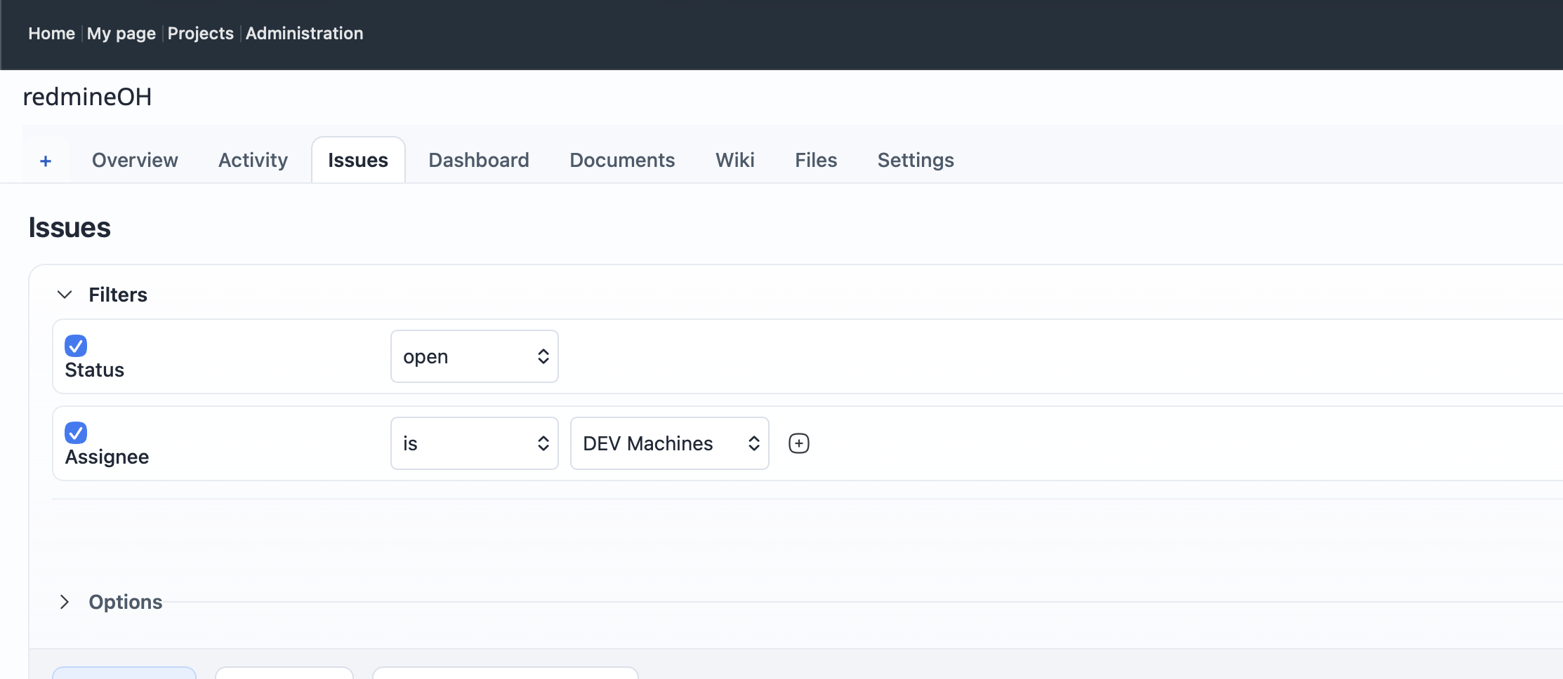
Codex task: Align issue filter rows into a compact inline layout
Fix the Issues → Filters section so each active filter is presented as a clean, aligned horizontal row instead of a stretched full-width block.
Current problem
The filter controls are visually misaligned:
- filter names sit far away from their operators and values;
- each filter occupies an unnecessarily tall full-width row;
- controls do not line up consistently between rows;
- the add-value button floats awkwardly after the Assignee field;
- the layout does not match the compact, calm styling used elsewhere in RedmineOH.
Use the attached screenshot as the visual reference.
Required layout
On desktop and laptop widths, each active filter row should read left to right as:
checkbox → field label → operator → value control(s) → add/remove control
For example:
☑ Status     [open]
☑ Assignee   [is] [DEV Machines] [+]
The rows should be compact and aligned to a shared grid.
Required work
-
Inspect the native Redmine filter markup under:
#query_form#query_form_content#filters-table.filter.field.operator.values
-
Identify existing RedmineOH rules that are causing filter cells or wrappers to expand vertically or occupy the full available width.
-
Adjust the Issues-page CSS so that:
- every filter is displayed as a horizontal row;
- checkboxes align vertically with the row controls;
- field labels use a consistent width;
- operators use a consistent width;
- value controls begin at the same horizontal position;
- select boxes and inputs use sensible compact widths;
- the add-value button remains directly beside the value control;
- row height is reduced;
- spacing is consistent between all controls.
-
Preserve support for filters with:
- one value;
- multiple values;
- text inputs;
- date inputs;
- relative date operators;
- user/project/version selects;
- no value field;
- multiple-value add/remove buttons.
-
Keep Filters and Options as separate collapsible sections.
Suggested desktop structure
Use CSS grid or flexbox with a stable layout similar to:
grid-template-columns:
  auto
  minmax(9rem, 14rem)
  minmax(9rem, 12rem)
  minmax(14rem, 1fr)
  auto;
Treat this only as a design direction. Adapt it to the actual Redmine markup rather than forcing inappropriate wrappers.
Responsive behaviour
At narrower widths:
- allow rows to wrap cleanly;
- keep the checkbox and field name together;
- place operator and value controls on the next line when necessary;
- keep controls readable and touch-friendly;
- avoid page-wide horizontal scrolling;
- do not truncate labels excessively.
At mobile width, a stacked layout is acceptable:
☑ Assignee
[is]
[DEV Machines] [+]
The breakpoint must not affect desktop alignment.
Visual styling
Match the rest of RedmineOH:
- compact row padding;
- soft borders;
- rounded input controls;
- calm neutral background;
- consistent font sizes;
- restrained hover and focus states;
- no large empty blocks between Filters and Options.
Do not turn each filter into a large card.
Scope and constraints
- Scope the fix to Issues query/filter forms.
- Verify saved queries and project issue lists.
- Do not globally modify generic
select,input,label,table,trortdstyles. - Do not change Redmine core templates unless CSS cannot solve the issue safely.
- Avoid excessive
!important. - Remove or narrow conflicting RedmineOH rules instead of adding brittle overrides.
- Preserve all JavaScript behaviour for adding, removing and changing filters.
Acceptance criteria
- Active filter rows are inline and compact at desktop widths.
- Field labels, operators and values align consistently across rows.
- The Assignee row no longer appears visually detached or overly wide.
- The add-value button sits directly beside its related control.
- Filters with different input types remain usable.
- Rows wrap cleanly on tablet and mobile widths.
- Filters and Options expand and collapse normally.
- Adding or removing filters still works.
- Saved queries still render correctly.
- No regressions appear on project lists, issue details, new issue or administration pages.
Deliverable
Report:
- files changed;
- selectors added, removed or narrowed;
- the CSS layout method used;
- the conflicting rule that caused the misalignment;
- filter types tested;
- viewport sizes tested;
- any remaining edge cases.
Files