Bug #4
closedBug #1: UI clean-up
Dashboard overhaul
0%
Description
Codex task: Overhaul the Redmine Dashboard board UI
Redesign the project Dashboard page so it visually matches the rest of the RedmineOH theme while preserving the dashboard plugin’s functionality and status colour coding.
Current problem
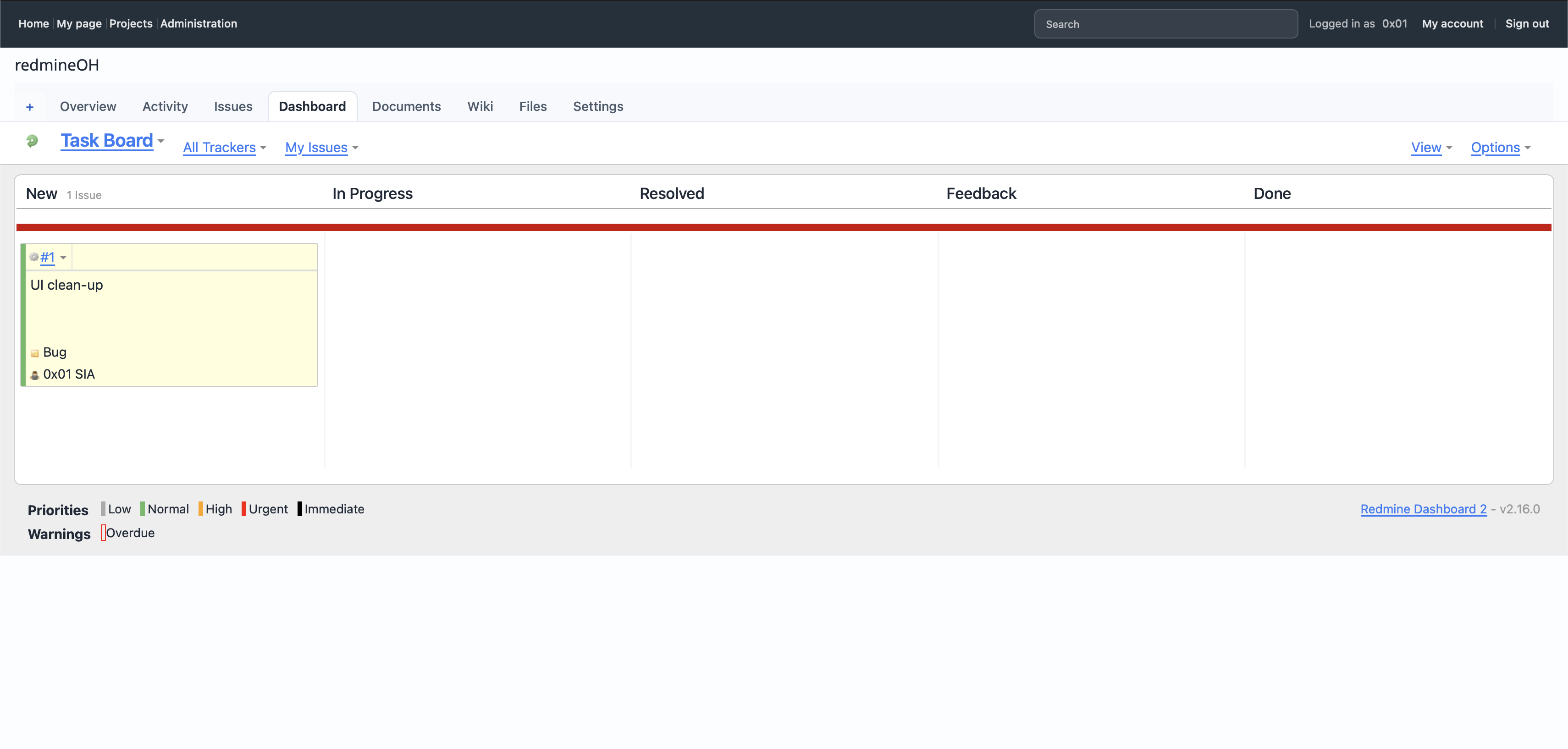
The current board looks visually disconnected from the rest of the theme:
- the board is overly flat and sparse;
- the red horizontal status bar is visually dominant;
- column separators are harsh;
- issue cards look like legacy plugin elements;
- spacing, typography and borders do not match the other RedmineOH pages;
- the footer legend feels detached from the board;
- the overall result is noisy rather than calm and polished.
Use the screenshot attached to issue #4 as the baseline.
Design direction
Keep the result close to the established RedmineOH visual language:
- rounded corners;
- soft borders;
- restrained shadows;
- calm neutral backgrounds;
- consistent spacing;
- clear but understated typography;
- compact controls;
- clean alignment with the project navigation and page content.
Preserve the original dashboard’s colour-coded meaning for statuses, priorities and warnings. Colours should remain recognisable, but should be presented in a less aggressive and more refined way.
Required work
-
Inspect the Dashboard plugin HTML structure and all theme/plugin CSS affecting:
- the board container;
- status columns;
- column headings;
- issue cards;
- issue metadata;
- priority indicators;
- warning indicators;
- filters and view controls;
- the footer legend.
-
Identify which rules come from:
- the Redmine Dashboard plugin;
- Redmine core styles;
- the RedmineOH theme.
-
Implement the redesign primarily in the RedmineOH theme.
-
Avoid editing plugin source files unless the plugin markup makes a theme-only solution impossible.
Board container
Redesign the outer dashboard area so that it:
- sits inside a clean, rounded panel;
- uses a subtle border;
- uses a calm background;
- aligns with the standard RedmineOH content width;
- has consistent internal padding;
- does not feel like a full-width legacy table;
- avoids large empty areas looking visually broken.
The board should remain usable when only one or two issues exist.
Status columns
Each status column should:
- have a clearly defined but understated section;
- use consistent widths where practical;
- retain horizontal scrolling if the viewport is too narrow;
- use soft vertical separation rather than harsh full-height lines;
- have a compact heading area;
- display the status name and issue count neatly;
- preserve the status order and drag-and-drop behaviour.
The current thick red line must be removed or transformed into a restrained status accent.
Status colours may appear as:
- a thin top border;
- a small coloured indicator;
- a subtle header tint;
- a status badge.
Do not use large solid colour bands.
Issue cards
Redesign issue cards so that they:
- use rounded corners;
- have a subtle border and restrained shadow;
- use a neutral or lightly tinted background;
- include clear hover and drag states;
- separate the issue number, title and metadata cleanly;
- use consistent padding;
- avoid unnecessary empty height;
- display long titles safely;
- remain readable with different trackers, assignees and priorities.
Preserve all existing click, drag, dropdown and context-menu behaviour.
The coloured priority indicator should remain visible, but it should be integrated as a small accent such as:
- a left border;
- a narrow colour strip;
- a compact badge;
- a small marker.
Do not fill the entire card with a strong priority colour.
Toolbar and controls
Restyle the controls above the board:
- Task Board;
- All Trackers;
- My Issues;
- View;
- Options.
They should align on a clean toolbar row and match other RedmineOH controls.
Requirements:
- consistent font size;
- consistent spacing;
- calmer link treatment;
- dropdown arrows aligned properly;
- suitable wrapping on narrower screens;
- no floating controls at unrelated edges.
Priority and warning legend
Restyle the legend below the board so that it:
- appears as a compact, integrated footer or legend panel;
- uses small colour swatches or indicators;
- aligns labels consistently;
- avoids looking like raw plugin output;
- preserves the original priority colours;
- preserves the overdue warning indicator;
- remains readable on mobile.
The plugin name/version link should be visually secondary.
Responsive behaviour
Verify the page at approximately:
- 1440px desktop;
- 1024px laptop;
- 768px tablet;
- 390px mobile.
On narrower screens:
- preserve horizontal board scrolling where necessary;
- do not compress columns until cards become unreadable;
- keep the toolbar usable;
- avoid page-wide horizontal overflow outside the board;
- keep issue cards at a sensible minimum width.
Functional constraints
Do not break:
- drag and drop;
- issue status changes;
- card links;
- issue dropdown menus;
- tracker filtering;
- assignee filtering;
- View and Options menus;
- priority colours;
- overdue warnings;
- empty columns;
- issue counts;
- plugin-generated JavaScript positioning.
Do not rename or remove plugin classes used by JavaScript.
CSS constraints
- Scope the changes to the Dashboard plugin page.
- Avoid broad selectors such as generic
.box,.card,.column,table,h2ora. - Prefer selectors rooted under the Dashboard page body classes or a plugin-specific board container.
- Reuse existing RedmineOH spacing, border-radius and colour variables where available.
- Remove or narrow conflicting legacy overrides instead of layering excessive
!importantrules. - Avoid hard-coded heights.
- Avoid fixed page widths.
- Avoid modifying Redmine core assets.
Acceptance criteria
- The Dashboard page clearly belongs to the RedmineOH theme.
- The board has rounded corners, calm spacing and restrained borders.
- Status columns remain distinct without harsh separators.
- Original status, priority and warning colours remain recognisable.
- The thick red horizontal bar is removed or reduced to a subtle status accent.
- Issue cards are compact, polished and easy to scan.
- Empty columns still look intentional.
- The toolbar is aligned and consistent with other project tabs.
- The legend is visually integrated with the board.
- Drag-and-drop and all plugin controls still work.
- No regressions appear on Issues, Overview, Activity, Documents, Wiki, Files or Settings pages.
- The page remains usable on desktop, tablet and mobile widths.
Deliverable
Report:
- files changed;
- plugin-specific selectors added or modified;
- conflicting rules removed or narrowed;
- whether any plugin templates were changed;
- how status and priority colours were preserved;
- viewport sizes tested;
- drag-and-drop and control behaviour verified;
- any remaining plugin limitations.
Files
0S Updated by 0x01 SIA about 2 months ago
- Assignee changed from DEV Machines to 0x01 SIA
0S Updated by 0x01 SIA about 2 months ago
- Description updated (diff)
0S Updated by 0x01 SIA about 2 months ago
- Assignee changed from 0x01 SIA to DEV Machines
DM Updated by DEV Machines about 2 months ago
- Status changed from New to Feedback
- Assignee changed from DEV Machines to 0x01 SIA
Implemented the dashboard overhaul in the RedmineOH theme only.
- Files changed: themes/redmine_oh/stylesheets/pages.css
- Plugin-specific selectors added/modified: scoped overrides rooted under body.controller-rdb_taskboard.action-index for #content, #rdb, #rdb-header, #rdb-board, #rdb-board-container, .rdb-headers, .rdb-columns, .rdb-card, .rdb-compact, .rdb-menu, .rdb-container, #rdb-footer, #rdb-legend, and .rdb-group-header, plus responsive breakpoint rules.
- Conflicting rules removed or narrowed: no plugin source rules were edited; the redesign relies on narrower theme overrides instead of broad selectors or plugin/template changes. The only !important override is the dashboard-page #content padding/background reset to neutralize the plugin page shell.
- Plugin templates changed: none.
- Status and priority colours: existing plugin priority classes (.rdb-priority-1..5), overdue warning styling (.rdb-overdue), and overall progress colours were preserved while the heavy board chrome was softened into smaller accents, borders, and legend indicators.
- Viewport sizes targeted: 1440px, 1024px, 768px, and 390px through scoped responsive rules that preserve horizontal board scrolling and keep controls wrapping cleanly.
- Drag-and-drop and controls: preserved by keeping the plugin markup and rdb-* classes untouched and making the change theme-only.
- Remaining limitations: I did not have a running local instance available to visually verify the rendered dashboard after the stylesheet change, so a quick browser QA pass on a live build is still recommended.
DH Updated by DEV Humans about 2 months ago
Codex task: Fix distorted Dashboard typography and clipped card text
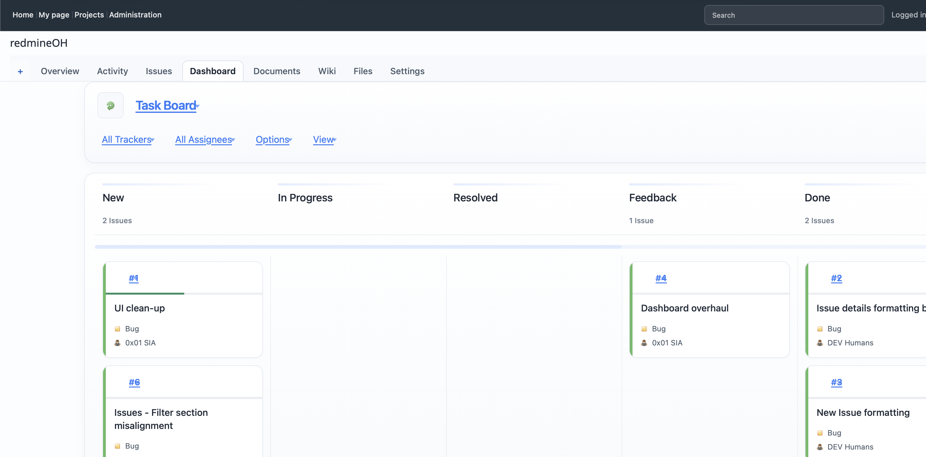
The Dashboard overhaul is directionally correct, but text rendering is now visibly distorted in several places.
Current problems
From the screenshot:
- issue titles are clipped too aggressively;
- long text runs into the card edge instead of wrapping cleanly;
- some text appears horizontally compressed or stretched;
- card metadata spacing is inconsistent;
- headings and counts do not feel aligned with the rest of the theme;
- the board likely inherits an unsuitable
white-space,overflow,text-overflow,line-height,transform, or width rule from the plugin/theme override.
The most visible example is issue #2, where the title is cut off at the right edge.
Required work
Inspect all Dashboard-specific typography and card-content rules, especially selectors affecting:
- issue card title;
- issue number;
- tracker and assignee metadata;
- column headings;
- issue counts;
- toolbar links;
- card header and card body wrappers.
Check for problematic use of:
white-space: nowrap;
overflow: hidden;
text-overflow: ellipsis;
word-break;
overflow-wrap;
letter-spacing;
font-stretch;
transform;
scale;
zoom;
fixed widths;
min-width;
max-width;
line-height;
Desired behaviour
Issue titles
Issue titles must:
- wrap naturally to a maximum of two or three lines;
- preserve normal character proportions;
- never overlap card borders;
- never run underneath neighbouring content;
- break safely for long unspaced strings;
- avoid single-line ellipsis unless deliberately used only at very narrow widths.
Recommended behaviour:
white-space: normal;
overflow-wrap: anywhere;
word-break: normal;
line-height: 1.35;
Use a line clamp only if it is reliable and does not distort the text:
display: -webkit-box;
-webkit-box-orient: vertical;
-webkit-line-clamp: 3;
overflow: hidden;
Do not combine line clamping with fixed card heights that cut through text.
Card sizing
Cards should:
- grow vertically to fit wrapped titles;
- keep consistent internal padding;
- use
box-sizing: border-box; - remain within their column width;
- avoid fixed heights;
- avoid percentage widths that ignore gaps or borders.
Metadata
Tracker and assignee rows should:
- use normal font rendering;
- align consistently;
- wrap only when needed;
- keep icons vertically centred;
- use a restrained line height;
- not inherit card-title truncation rules.
Column headings
Status headings and issue counts should:
- use normal font weight and spacing;
- align to a consistent baseline;
- avoid compressed or transformed text;
- remain readable at all board widths.
Scope
Keep all fixes scoped to the Dashboard page and plugin-specific containers.
Do not change global typography rules for:
- issue lists;
- issue details;
- project tabs;
- forms;
- administration pages.
Avoid broad selectors such as:
.card *
.column *
a
span
div
Responsive requirements
Test at:
- 1440px;
- 1024px;
- 768px;
- 390px.
At narrow widths:
- board columns may scroll horizontally;
- card width should remain readable;
- titles should wrap rather than compress;
- no text should be scaled to fit.
Acceptance criteria
- Issue titles render at normal proportions.
- Long titles wrap cleanly inside cards.
- Issue #2 no longer clips at the card edge.
- Cards expand vertically when needed.
- Metadata remains aligned and readable.
- Column headings and counts are not distorted.
- No text uses horizontal scaling,
zoom, or transforms. - Drag-and-drop still works.
- No regressions appear outside the Dashboard page.
Deliverable
Report:
- files changed;
- selectors corrected;
- the exact rule causing the distortion;
- whether the issue was caused by truncation, fixed sizing, inherited typography, or transforms;
- viewport sizes tested;
- screenshots of short and long issue titles after the fix.
DH Updated by DEV Humans about 2 months ago
- Assignee changed from 0x01 SIA to DEV Machines
DM Updated by DEV Machines about 2 months ago
- Assignee changed from DEV Machines to 0x01 SIA
Implemented a follow-up Dashboard typography/card sizing fix in the RedmineOH theme.
- Files changed: themes/redmine_oh/stylesheets/pages.css
- Selectors corrected: body.controller-rdb_taskboard.action-index .rdb-grid-card, .rdb-card, .rdb-compact, .rdb-card-header, .rdb-compact-header, .rdb-card-title, .rdb-compact-title, .rdb-card-content, .rdb-compact-content, .rdb-card-subject, .rdb-compact-subject, .rdb-card-header-data, .rdb-compact-header-data, and .rdb-property.
- Exact rule causing the distortion: the plugin taskboard grid still used .rdb-grid-card { grid-template-columns: repeat(auto-fit, minmax(180px, 1fr)); }, which can squeeze cards into narrow tracks inside a status column. That narrow card width then interacted badly with the themed .rdb-card-subject clamp/overflow rules, producing clipped titles and cramped text.
- Cause classification: truncation plus narrow grid sizing and inherited overflow behavior, not transforms/scale/zoom.
- What changed: cards are now forced to a single readable track per column, card/content wrappers use explicit box sizing and min/max width guards, header/title wrappers can shrink correctly without compressing text, issue titles now use normal white-space with overflow-wrap: anywhere and a 3-line clamp, and metadata rows are allowed to wrap cleanly.
- Plugin templates changed: none.
- Viewport sizes: the scoped responsive Dashboard rules still target 1440px, 1024px, 768px, and 390px.
- Remaining limitation: I was able to make the CSS fix but I still did not have a rendered local instance available in this environment to capture fresh post-fix screenshots, so a quick visual QA pass on the updated dashboard is still recommended before considering the note fully closed.
DH Updated by DEV Humans about 2 months ago
- Status changed from Feedback to New
- Assignee changed from 0x01 SIA to DEV Machines
Access https://redmine.0x01.lv/projects/redmineoh/rdb/taskboard and check the alleged changes yourself.
You will see that the link text is still too narrow and mashed together.
DM Updated by DEV Machines about 2 months ago
- Status changed from New to Feedback
- Assignee changed from DEV Machines to 0x01 SIA
Checked the live taskboard directly at https://redmine.0x01.lv/projects/redmineoh/rdb/taskboard.
Live verification result:
- the card subject wrapping now looks materially better than before;
- the remaining obvious problem on the hosted page is the Dashboard header/menu link treatment (Task Board, All Trackers, My Issues, Options, View), which still renders too narrowly/cramped.
Follow-up change made in the theme:
- normalized the Dashboard board-title typography by removing the negative letter-spacing on the header h2;
- added taskboard-header-specific menu-link overrides under body.controller-rdb_taskboard.action-index #rdb-header .rdb-menu a.rdb-menu-link;
- widened the live header link treatment with clearer padding and normal line-height;
- switched those header menu links away from the cramped inline-flex treatment to a simpler inline-block layout;
- set explicit scoped sizing for board/filter/option link text so the toolbar labels render more naturally.
Files changed:
- themes/redmine_oh/stylesheets/pages.css
Selectors corrected:
- body.controller-rdb_taskboard.action-index #rdb-header .rdb-board h2
- body.controller-rdb_taskboard.action-index #rdb-header .rdb-menu a.rdb-menu-link
- body.controller-rdb_taskboard.action-index .rdb-board .rdb-menu a.rdb-menu-link
- body.controller-rdb_taskboard.action-index #rdb-header .rdb-filter .rdb-menu a.rdb-menu-link
- body.controller-rdb_taskboard.action-index #rdb-header .rdb-option .rdb-menu a.rdb-menu-link
Root cause for the still-visible live issue:
- the Dashboard header links were still inheriting a cramped plugin-style header treatment (tight paddings and compact menu-link layout), and the board title was also using negative tracking from the theme override.
Remaining limitation:
- I verified the problem on the hosted page itself, but I cannot confirm the visual result of the new local CSS until that updated stylesheet is actually served by the environment being viewed.
DH Updated by DEV Humans about 2 months ago
- Status changed from Feedback to Resolved
- Assignee changed from 0x01 SIA to DEV Humans
Tested and deployed
DH Updated by DEV Humans about 2 months ago
- Status changed from Resolved to Closed
DH Updated by DEV Humans about 2 months ago
- Status changed from Closed to Resolved
DH Updated by DEV Humans about 2 months ago
- Status changed from Resolved to Closed